Blog
5 Infographic Design Tips that Marketers Need to Follow

There are many marketing techniques that become all the rage for a while only to slip away into oblivion after a while. Then there are the few that stick, and become a mainstay in every professional’s marketing tool kit.
The Infographic is one technique that has definitely has stood out.
Now some may say that infographic are a content format and not a ‘technique’.
While it’s indeed a content format on its own, it is also the backdrop of the visual web and its gradual emergence. Text-visual combo formats like infographics are nothing short of a technique that can change many equations.
Below we’ll briefly discuss infographics and their benefits, and discuss the best practices to create them.
Why infographics?
Because more than 90% information transmitted to and processed by the human brain is visual. In the era of auto-play videos, push notification, and all things social media, our attention spans are becoming shroter and shorter. This means when sending information it needs to be attention grabbing, and that means visuals. Chances are, a visual message is going to be noticed whereas your non-visual messaging has a good chance of not being received at all.
We know social media is has become the lifeline of digital marketing. On social media, infographics are three times more likely to be shared than non-visual content. The CMO council’s research which predicted the use of infographic will increase in 2016. In short, infographic is an attention-grabber and adds value to information.
Infographic best practices
By following best practices, you add value to the infographic. The infographic scores high in the virality chart, receives more attention and gets more likes and shares on social media. The best practices include:
Avoid the temptation
You might feel tempted to add flashy design elements to the infographic. Don’t. Not only will it result in visual clutter, but also go against the tenets of minimalism, a principle that designers revere these days.
A survey done on 3000 people by Siegel + Gale revealed they prefer simple design than complex design. Keep the infographic simplistic to garner a high rate of user-engagement.
Remember, the graphic elements you are adding are supposed to serve a purpose. The purpose is to accompany the texts in the infographic. Hence, only add relevant graphics. A simple graphic is a clean graphic, and cleanliness is next to godliness.
Dig into big data
There’s a huge difference between ordinary data and big data. Big data boils down to detecting pattern. The marketing world is fond of big data because it can unearth valuable insights for them.
An enterprise can use big data analytics tools and pull its internal workflow management data, client communication data, previous sales data, data related to customer satisfaction level, etc, discover pattern in them and use the pattern in an infographic.
Such an infographic can inform industry insiders as well as the outsiders about how the business/the industry is going. The infographic needs to present the data in an entertaining manner. It’s easy to separate a data-rich infographic from a data-scarce infographic. A data-rich infographic has numbers, stat figures, embedded graphs whereas an infographic lacking data only has texts. See the infographic below:
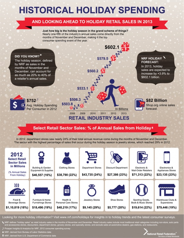
You can only see numbers, and quickly grab useful information. Now see the infographic below:
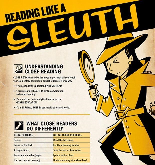
There’s information, but no numbers. There’s no pattern, only some behavior related details. The difference between the two infographics is evident. Hence, harness big data so that your infographics command more authority.
Color selection
Color selection is important for infographic design. Let’s say you go for monochromatic color scheme where one color is dominant and other colors are its shades. If the subject of the infographic is such that information is more important than graphics, or if you are designing the infographic for an audience who you know would be indifferent to colors, such as C-suite executives of a business firm, go for this color scheme.
There should be a consistency between the level of content and the color you select. Alongside consistency, contrast is also important. Some colors create a nice contrast with each other while some colors don’t. Choose the contrasting colors to bring a contrast, but don’t overdo it. The background color should never be deep, it should always be pale. Another important thing to keep in mind is the color you select should match the typeface.
Attention-grabbing words
Content is king. The texts in the infographic should be catchy enough to validate this aphorism and grab the attention of the onlookers. An infographic doesn’t need too much texts. The volume of texts is 15-200 max.
Make sure not a single word is unnecessary. Give special attention to the headline. A good and powerful headline doesn’t stop after capturing one’s attention. It describes the whole infographic with brevity. The ideal length of the headline is 80 characters or less.
The flow is pivotal. If some phrases are punchy type while other phrases are mundane, then that would hurt the flow. So make sure there’s a perfect harmony of each line and most importantly, the message is not simply thrown at them but delivered in a smooth manner, and only after they make progress in the thought process, prompted by the infographic.
Brand message
Even though information is at the core of an infographic, you can’t wrap things up after putting too much information into it. The infographic needs to touch on the crucial aspects pertaining to your brand and drive home that they should purchase from you, though in a subtle manner.
Charts, data sheet, etc should be insightful alongside being visually compelling. The key takeaways should be highlighted to guarantee a comprehensive understanding. And all these should be done for only one purpose - making it easy for users to digest your brand’s message.
The message is important, and so is how you plant it in the infographic. If you add the message using quality content and rich graphics and images, then users will have an easy time getting it and decrypting it.
Images Courtesy: pixabay.com

Adam Frankel
Adam Frankel is President and CEO of Frankel Interactive, a leading South Florida digital agency specializing in custom websites development, ecommerce development and digital marketing. For over 15 years he's been working with businesses and government agencies to bring their organizations online in order to build brand awareness, communicate with stakeholders, generate leads and drive sales. His belief is that all businesses need to keep up with technological trends including the continual transition from desktop to mobile, search engine algorithms changes, and social media engagement. His goal is to help them implement strategies to successfully compete in an ever crowding digital marketplace. When he isn't touting the benefits of web-based marketing, he enjoys fishing and spending time on the waters surrounding Miami with family and friends.