Blog
4 Easy Tips to Beat Google’s Mobile-First Index

Google's Mobile-First index can lead to a paradigm shift in the way indexing works. It necessitates mobile-friendly individual pages besides a mobile-friendly website.
Here’s a brief synopsis of mobile-first indexing:
What is it?
Up until the announcement, the desktop version of webpage’s content was Google’s indexing priority. But now the priority will be mobile-optimized pages. This change has come as a result of the large volume of users that have been migrating to handheld platforms and away from desktops.
Is this new?
Yes and no.
Smart businesses have been making their websites mobile-friendly for several years now. But never before has Google advised bringing such efforts to the granular level i.e. individual pages of a website.
Hence, outwardly there’s nothing‘new’ as Google will continue to have a unique indexing mechanism for both mobile and desktop versions of webpages. However, pages optimized for mobile devices will be the priority and that’s something new.
How should you adjust your webpages to accommodate the change in indexing? Read on to find answers:
Mobile-friendly configuration
Responsive design may be the holy grail of mobile-friendliness, but not the only one. There are other configuration methods such as dynamic serving and different URLs. I don’t suggest the latter because even though Google has an agnostic approach to separate URLs, visitors may get confused.
You can choose dynamic serving instead of responsive design. The URLs will be the same, but the HTML copy will change depending on the device being used. Dynamic serving comes with a few benefits. One of them, perhaps the most crucial one is fast loading time. As separate HTML versions are sent to users with separate devices, handheld users download a smaller version of the original content, which doesn’t take too much time to load.
On the flipside, dynamic serving is a bit hard to implement. Google has enlisted some mistakes that occur with dynamic serving. Besides, dynamic serving is either unidirectional or bidirectional redirecting. Mobile developers are cautioned against redirects. Other tips for mobile-friendly configuration include not using robots.txt file, signaling to Google that individual pages are optimized for mobile, and a rich user-experience.
Getting rid of clutter
Mobile design is often plagued by too muchclutter. Cluttercancome in all forms. At times, it’s difficult to identify whether an onpage element amounts to visual or technical distraction.
Here are some of the elements that mobile designers should get rid of:
#Pop-ups: Mobile users detest pop-ups more than their desktop counterparts. Because desktop screens are larger, it’s easy to click on the “X” and close the virtual pop-up bar. But mobile users tap instead of clicking and often face difficulty locating the close button icon.
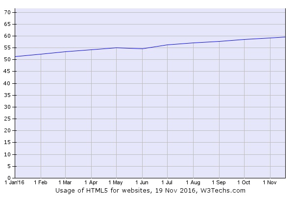
#No flash: Why use flash when there’s Javascript and HTML5? The graph below shows the ever increasing popularity of HTML5. Take a look:
Flash is old school and not conducive in terms of ROI. So, no Flash.
#Reduce accidental taps: Users feel very annoyed when they accidentally tap on an icon. Scrolling issues and crowded layouts are the culprits behind accidental taps. Fix scrolling shortcomings and make the layout simplistic.
#Large images: Large images can make the loading time slow. So use images that are not so large. Use compression software to resize the image.
#Codes and pages: The source code is what determines the functionality of a site. Examine it to remove the unnecessary codes. Also, get rid of doorway pages. Other than being redundant, such pages can trigger unnecessary redirects, which Google hates.
Getting rid of the above clutter can help you render a perfectly mobile-friendly website, optimized for Google’s mobile-first index.
Localization matters
When you are building a user-friendly mobile page, localization matters big time.
Why does it matter so much?
Because Google’s report on local search behavior reveals local searchers are more likely to pursue action compared to non-local searchers. The report reads “50 percent of consumers who conducted a local search on their smartphone visited a store within a day, and 34 percent who searched on a computer/tablet did the same.”
To make mobile-optimized pages localized, you need to:
? Include the state, city and zip code info in the title tag. Google has started allowing site owners to increase the length of title tags for mobile. They have 78 characters - enough to add location specific details.
? Alt tags and all other meta tags should have city data.
? All pages should have contact details of the business such as physical address, phone, fax and email.
? The content needs to be the same for separate locations while the contact details must change.
None of these steps is difficult to implement. Along with these steps, a business can give users some location-specific incentives such helping them find certain places.
New snippets
Site owners often wonder whether mobile visitors have the patience to go through the entire onpage content. Such apprehensions are justified. Studies have found a mean decrease of 35% in app session length. Mobile visitors have a shorter attention span than desktop users.
Content, not detailed enough may not get a featured snippet. But mobile users prefer content that’s brief, concise and framed like a short answer. Does that mean featured snippet is obtainable only for desktop users?
No.
Jennifer Slegg of the SEM Post explained that Google is updating featured snippets and making them tailor-made for mobile users. Such snippets will be displayed against “Know-Queries” or simple queries. Such queries can be names of individuals or places. As a business, expect people search using names of areas and places. Optimize your site for such places to make it look mobile-friendly.
Featured snippets are more important for desktop users than mobile users, largely because answer to those snippets are detailed whereas answer to “Know-Queries” snippets are short and precise. So make sure that you have pages with long answer as well as pages with brief and quick answers.
Summing up
The mobile-first index creates new concepts for consideration when optimizing your website. Google hates nothing more than those that try to trick the system, so sticking with these tips will keep you safe and set you on your way for a properly mobile optimized site.
Image Courtesy: pixabay.com
Adam Frankel
Adam Frankel is President and CEO of Frankel Interactive, a leading South Florida digital agency specializing in custom websites development, ecommerce development and digital marketing. For over 15 years he's been working with businesses and government agencies to bring their organizations online in order to build brand awareness, communicate with stakeholders, generate leads and drive sales. His belief is that all businesses need to keep up with technological trends including the continual transition from desktop to mobile, search engine algorithms changes, and social media engagement. His goal is to help them implement strategies to successfully compete in an ever crowding digital marketplace. When he isn't touting the benefits of web-based marketing, he enjoys fishing and spending time on the waters surrounding Miami with family and friends.